
Sports aren’t calm
They’re fast.
Unpredictable.
Emotional.
One moment changes everything.
And that’s exactly why sports visuals can’t feel static.
If they do — they fail.
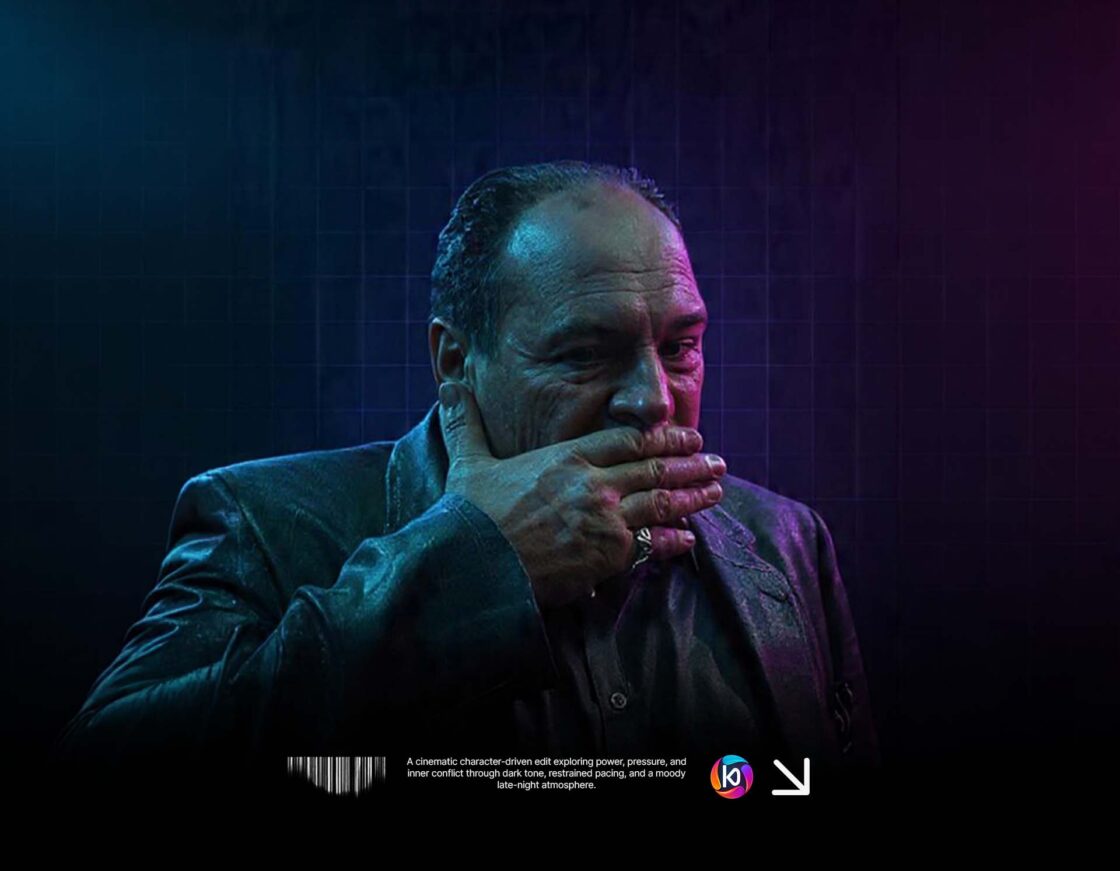
It’s not about showing the sport
It’s about showing the feeling behind it.
The pressure before the shot.
The tension between opponents.
The moment right before impact.
That’s what people connect with.
Not just the action —
but what it means.
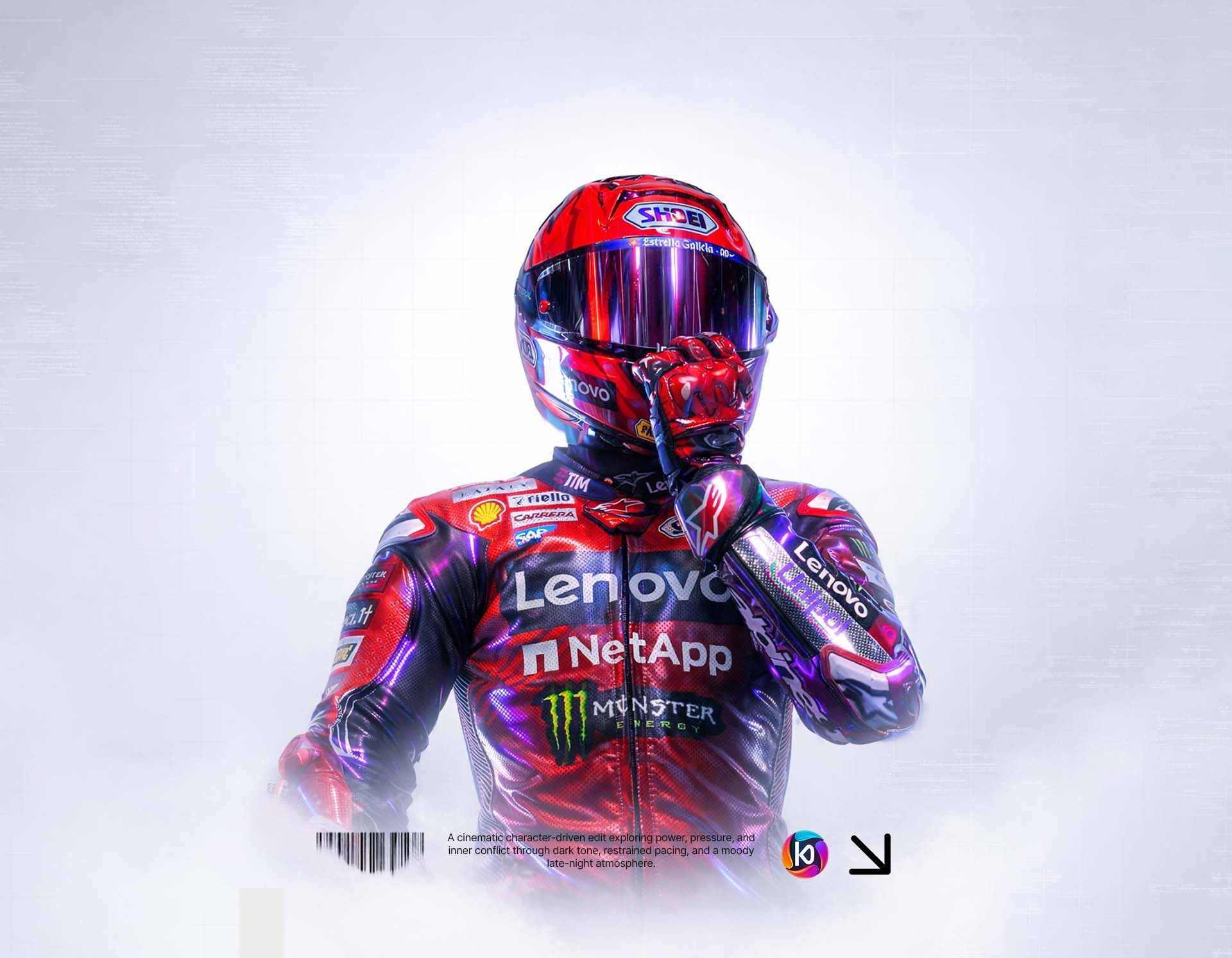
Movement is everything
Not to make you feel something.
Even in a static image.
A good sports visual should feel like it’s about to move.
That comes from:
- direction in composition
- motion blur or streaks
- body positioning
- camera angle
Everything should push forward.
Nothing should feel stuck.
Contrast creates tension
Sports are built on contrast.
Win vs loss.
Control vs chaos.
Calm vs explosion.
Your visuals should reflect that.
- bright highlights vs deep shadows
- sharp focus vs blurred background
- one dominant subject vs everything else fading
That tension is what creates intensity.
Lighting changes everything
Think about how sports feel in real life:
- stadium lights
- night games
- spotlight moments
Lighting isn’t just aesthetic.
It’s emotional.
Hard light → intensity
Soft light → control
Dark scenes → pressure
Use it with intention.
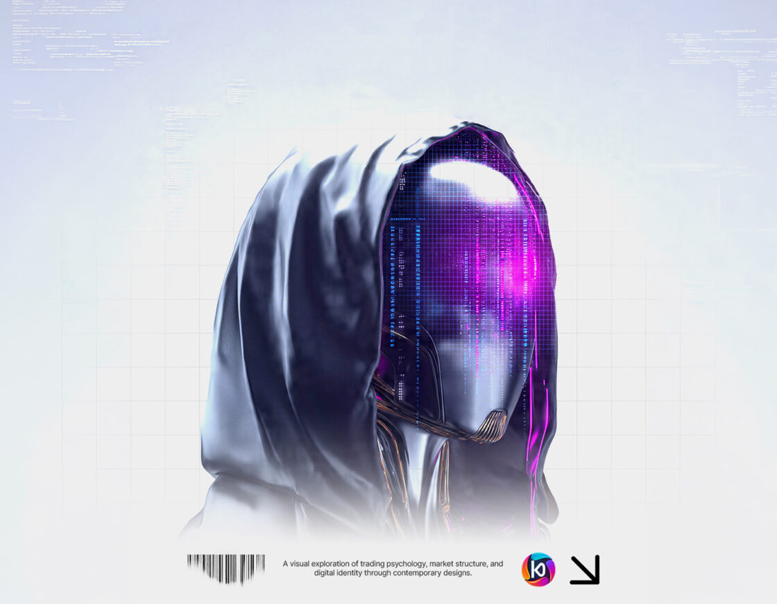
Color isn’t random
Color carries meaning.
In sports visuals, it’s often:
- team identity
- emotion (red = aggression, blue = control)
- atmosphere (cold vs warm)
But the key is restraint.
Too many colors → chaos
Controlled palette → impact
The real goal
A good sports visual should make you feel something instantly.
Before you even process what you’re looking at.
It should feel like:
something matters
something is about to happen
something is at stake